 |
| Graph Source |
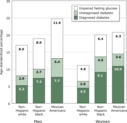
This graph is very good, because it shows the difference in diagnoses of Type 2 diabetes according to race, normally I wouldn't like a graph organized like this on my blog considering I am about class not race, but I think it is important to show this as well. As you can see the numbers are averagely higher in men and in Mexican Americans. What does this tell you about the races and how they live their lives? Does it show what the problems are? Yes I think it does.
Good job, Stephanie. 2 for the week.
ReplyDelete